(K)CSSで作った対談(会話)式吹き出しをLINE風にしてスマホにも対応させる
以前、CSSで吹き出しを作って対談式のレイアウトを組んでみたんですが、PCのみのレイアウト組みだったので、新たにスマホ版の物を組んでみました(・∀・)
PC版との違いを検証してみれば面白そうなので、見比べながら検証しようと思います。
@akiueoさんのブログで「どなたか改良版を」って書いてあったので、LINEのグループトークみたいなレイアウトの改良版をアップします(頼まれてもいませんが・・・)
CSSで会話形式のフキダシデザインを作ってみる – AIUEO Lab2
以前組んだ奴とほとんど同じレイアウトで対応させた例
以前の物は横幅指定していたため、スマホではキチンと表示されませんので、width指定のところはすべて%表示に治す必要があります。【HTML】はほとんど変更なしです。<img>に直接指定しているサイズ指定を取っ払うのみです。
HTMLマークアップ
【HTML】
<body>
<div id="wrapper">

<div class="question_Box">
<div class="question_image"><img src="img/question_image01.jpg" alt="質問者の写真"/></div>
<div class="arrow_question">
     質問テキスト質問テキスト質問テキスト質問テキスト質問テキスト質問テキスト
</div><!-- /.arrow_question -->

</div><!-- /.question_Box -->


<div class="question_Box">
<div class="answer_image"><img src="img/question_image02.jpg" alt="解答者の写真" /></div>
<div class="arrow_answer">
     解答テキスト解答テキスト解答テキスト解答テキスト解答テキスト解答テキスト
</div><!-- /.arrow_answer -->

</div><!-- /.question_Box -->
</div><!-- /#wrapper -->
左右に空白をあけるため、「wrapper」で囲んでおきます。
CSSをちょこっと変更
アイコン画像を%サイズにして、吹き出しもpx指定から%指定に変更して、あとは微調整です。
[CSS]
body{
     width:100%;
     min-width: 320px;
     margin:0;
     padding: 0;
}


#wrapper{
     margin: 20px auto;
     width:96%;
}


.arrow_answer,
.arrow_question {
    position: relative;
    background: #fff;
    border: 1px solid #c8c8c8;
    border-radius: 10px;
    width:75%;
    font-size: 11px;
    padding:3%;
}


.arrow_question {
    float: right;
}


.arrow_answer:after,
.arrow_answer:before,
.arrow_question:after,
.arrow_question:before {
    top: 30%;
    border: solid transparent;
    content: " ";
    height: 0;
    width: 0;
    position: absolute;
    pointer-events: none;
}


.arrow_question:after,
.arrow_question:before {
    right: 100%;
}


.arrow_answer:after,
.arrow_answer:before{
     left: 100%;
}


.arrow_answer:after,
.arrow_question:after {
    border-color: rgba(255, 255, 255, 0);
    border-width: 8px;
    margin-top: -8px;
}


.arrow_answer:after{
    border-left-color: #fff;
}


.arrow_question:after{
    border-right-color: #fff;

}


.arrow_answer:before,
.arrow_question:before {
    border-color: rgba(200, 200, 200, 0);
    border-width: 9px;
    margin-top: -9px;
}


.arrow_answer:before{
    border-left-color: #c8c8c8;
}


.arrow_question:before {
    border-right-color: #c8c8c8;
}


.question_image{
     float: left;
     width:15%;
}


.answer_image{
     float: right;
     width:15%;
}


.answer_image img,
.question_image img{
     border-radius: 50px;
     width: 100%
}


.question_Box{
     width: 100%;
     overflow: hidden;
     margin-bottom: 8%;
}
根本的な部分で当然bodyは100%とmin-widthを指定。
吹き出し部分と画像のサイズ指定をpixelから%指定にして、構造的に吹き出しの飛び出た部分はちょいと上にしてサイズを小さくしました。
横幅をpx指定から%指定にするだけっちゃ、するだけなんで比較的簡単に実装できます。
吹き出しが動かないように固定位置で配置する場合
テキストの量によって、吹きだしの位置が変動するので、アイコンの横に固定させたい場合は、以下のCSSに変更すればOKですね(・∀・)
【CSS】
.arrow_answer:after,
.arrow_answer:before,
.arrow_question:after,
.arrow_question:before {
    top: 25px;
    border: solid transparent;
    content: " ";
    height: 0;
    width: 0;
    position: absolute;
    pointer-events: none;
}
スマホって事でみんな大好き(?)LINE風にデザインしてみます
吹き出し作っているうちに面白くなってきたんで、新たに一度は見たことあるLINEのグループトーク風のレイアウトもCSSのみで組んでみました。
曲がった吹き出しのラインの作成は以下のサイトを参考にさせていただきましたm(_ _)m
【5パターン】画像を使わず CSS3 のみで作れる吹き出しを作ってみた – Pure CSS3 Balloons
吹き出し部分は「boader」ではなく、縦横30pxずつの2つの正方形を作成して「border-radius」で角を曲げて2つ重ねてます。
【HTML】
<body>
<div id="wrapper">
<img src="img/question_image01.jpg" alt="質問者" class="left-image"/>
<div class="question_box">
<p class="name">質問者</p>
<div id="arrow_question">
          ここに質問の文章
</div>
</div><!-- /.question_box -->

<div class="answer_box">
<p class="name02">解答者</p>
<div id="arrow_answer">
     ここに解答の文章
</div>
</div><!-- /.answer_box -->
<img src="img/question_image02.jpg" alt="解答者" class="right_image"/>

</div><!-- /#wrapper -->
</body>
【CSS】
body{
     width:100%;
     min-width: 320px;
     margin:0;
     padding: 0;
     background-color: #6f92c0;
}

#wrapper{
     margin: 20px auto;
     width:96%;
}

.question_box,
.answer_box{
     width:80%;
}

.question_box{float: right;}
.answer_box{float: left;}


img.left-image,
img.right_image{
     width:15%;
     margin-right: 10px;
}

img.left-image{float: left;}
img.right_image{float: right;}


p.name02,
p.name{
     font-size: 14px;
     color: #fff;
     margin:0;
}

p.name02{text-align: right;}


#arrow_answer,
#arrow_question {
     position: relative;
     display: inline-block;
     padding: 3%;
     width: 88%;
     font-size: 13px;
     margin-left:3%;
     margin-top: 3px;
     margin-bottom: 25px;
     color: #000;
     border-radius: 10px;
}

#arrow_question {
     background: #fff;
}

#arrow_answer {
     background: #85e249;
}

#arrow_answer:before,
#arrow_question:before {
     content: "";
     position: absolute;
     top: 0px;
     margin-left: 0;
     display: block;
     width: 30px;
     height: 30px;
     z-index: -1;
}

#arrow_question:before {
     left: -10px;
     background: #fff;
     border-radius: 0px 30px;
}

#arrow_answer:before{
     right: -10px;
     background: #85e249;
     border-radius: 30px 0;
}


#arrow_answer:after,
#arrow_question:after {
     content: "";
     position: absolute;
     top: -10px;
     margin-left: 0px;
     display: block;
     width: 25px;
     height: 25px;
     background: none repeat scroll 0% 0% #6f92c0;
     z-index: -1;
}

#arrow_question:after {
     left: -12px;
     transform: rotate(10deg);
     border-radius: 0px 30px;
}

#arrow_answer:after {
     right: -12px;
     border-radius: 30px 0px;
     transform: rotate(20deg);
}
弱点は吹き出し部分の作りのため背景画像をベタ塗りじゃないと変な感じになってしまう事ですね。この辺改善の余地アリです。
あと、ブラウザによってうまく表示できないかもしれません。
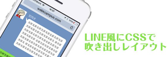
iPhoneのSafariなら普通にそれっぽく見えるはず。
※横幅を狭くして見るかスマホで見て下さい
まとめ
あまり凡庸性のあるレイアウトではありませんが、現代人が一番見慣れた会話形式のレイアウトってLINEだろうなって思います。
けど、あんまりWEBページを見てるって感じじゃないかもしれませんが、限定コンテンツとかにこんなレイアウトもいいかもと思いながら、今回は以上ですm(_ _)m
Comment
はじめまして。
AKIといいます。
対話式のブログを作ろうと思っていたところ、けぃしぃさんのこの記事をたまたま見つけて参考にさせて頂きました。
参考というよりほぼそのままですが…(汗)
本当にためになるソースを公開していただいてありがとうございました。
>AKIさん
お役に立ててよかったです。
サイトも見させていただきました。面白いコンセプトのサイトですね(・∀・)
更新楽しみにしていますww