(K)CCSで作成した水平ラインを使った見出しタイトル2種類

CSS3やらモバイルファーストの概念やSEOの観点からも、見出しに画像を使うのはほとんどなくなり、せいぜいCSSで背景画像に使う程度。<h>タグを使う見出しの部分はHTMLでテキストを書いてCSSで装飾するのが理想となってます。
水平ラインを使った「border-bottom」だけでは味気ないので、水平ラインを使った応用型の見出しタイトルのCSSデザインを2つご紹介。
(1)テキストの左右に水平ラインを引く※擬似要素を使用
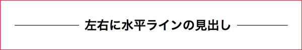
下にボーダーを引くだけでは芸がないって場合に有効なデザインかと思います。
HTMLは至ってシンプルに<h>を指定するのみ
【HTML】
<h2><span>左右に水平ラインの見出し</span></h2>
【CSS】
h2{
   position: relative;
   text-align: center;
}
h2:before {
    border-top: 1px solid;
    content: "";
    position: absolute;
    top: 50%;
    left: 0;
    width: 100%;
}

h2 span {
    background-color: white;
    display: inline-block;
    padding: 0 10px; /*ラインとテキストの間を調整*/
    position: relative; /*水平ラインが突き抜けないように*/
}
ポイントとしては、<h>の中に挟んでいる<span>に「 position: relative;」で位置指定しないと、「before」に指定しているボーダーがテキストを突き抜けます。
テキストとラインの間隔は「padding」で設定します。
この指定の弱点は、<span>に「background-color」を設定して、<before>に設定している水平ラインを無理やり見えなくしているので、背景がベタ塗り以外の領域で使用できないことです。
(1-2)テキストの左右に水平ラインを引く※CSS3のグラデーションを使う
【HTML】
<h2>左右に水平ラインの見出し</h2>
【CSS】
h2{
  display: table;
  text-align: center;
  white-space: nowrap;
  width: 100%;
}
h2:after,
h2:before{
  content: '';
  display: table-cell;
  width: 50%;
  background: -webkit-linear-gradient(transparent 50%, currentColor 50%, currentColor -webkit-calc(50% + 1px), transparent -webkit-calc(50% + 1px));
  background: -webkit-gradient(linear, left top, left bottom, from(transparent), color-stop(50%, currentColor), color-stop(currentColor calc(50% + 1px)), to(transparent calc(50% + 1px)));
  background: linear-gradient(transparent 50%, currentColor 50%, currentColor calc(50% + 1px), transparent calc(50% + 1px));
  -webkit-background-clip: padding;
  background-clip: padding;
}
h2:after {
  border-left: 1em solid rgba(0,0,0,0 );
}
h2:before {
  border-right: 1em solid  rgba(0,0,0,0 );
}
最後の2つのプロパティで水平ラインとテキストの空間を調整してるんですが、なぜかfirefoxではガチの透明になって透けてしまい空間の調整ができません「transparent;」を指定しても無理でした。
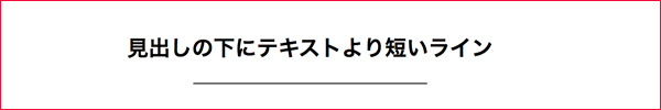
(2)見出しの下にテキストより短いラインをCSSで引く
個人的主観ですが、フラットデザインやゴーストボタンとかシンプルなWEBデザインが流行った頃から実装し始めたサイトが多そうなイメージだけど、日本語じゃなくて英語でWEBフォントを使ったりしたほうがしっくり来るかも。
【HTML】
<h2>見出しの下にテキストより短いライン</h2>
【CSS】
h2{
  text-align: center;
  position: relative;
}
h2:after{
  width:145px;
  content: "";
  border-bottom: 1px solid #000;
  position: absolute;
  top:0;
  left: 0;
  right: 0;
  bottom: -20px;
  margin:auto;
}
テキストに指定している<h2>を基準にafter要素で下ラインを指定して、位置調整しています。
下ラインの長さをpxじゃなくて%指定したい場合は以下を指定。
h2:after{
  width:20%;
  content: "";
  border-bottom: 1px solid #000;
  position: absolute;
  left: 40%;
  right: 40%;
  bottom: -20px;
ごりごりデザインしたWEBサイトむきではないですが、フラットデザイン系のシンプルな場合はこのようなぷちアクセントな見出しの装飾は有効です。自分のデザインの引き出しとしてまとめさせていただきました。今回は以上です。