IE11でflexboxのalign-items:centerが天地中央に表示できないバグ
サイトの下層ページの見出しなどでバックグランド画像の前にテキストを真ん中に配置するレイアウトがありますが
↓こんな感じのレイアウト
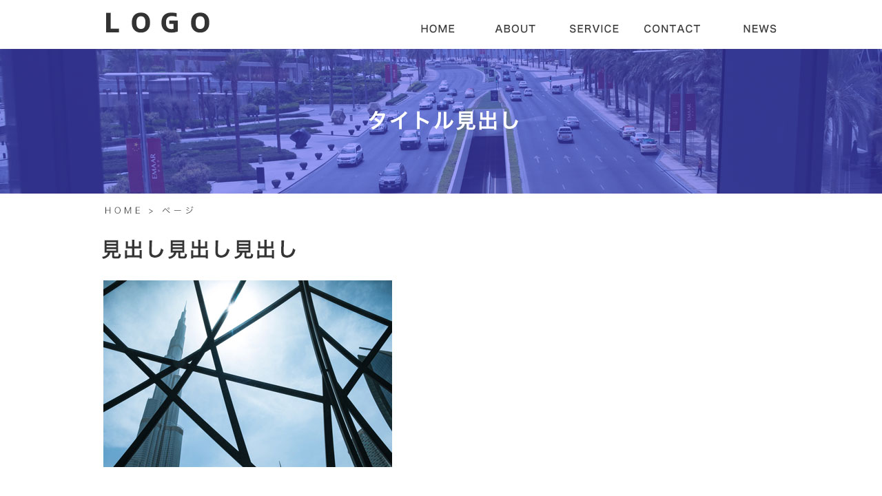
左右中央配置は「text-align: center;」や「margin: auto;」で対応させるが、
天地中央はflex boxの「align-items:center」が有効。
.page_ttl {
    min-height: 200px;
    display: flex;
    align-items: center;
    background: url(../img/bg_ttl.jpg);
    background-size: cover;
}
けど、IE11で表示させるとこんな風になる↓
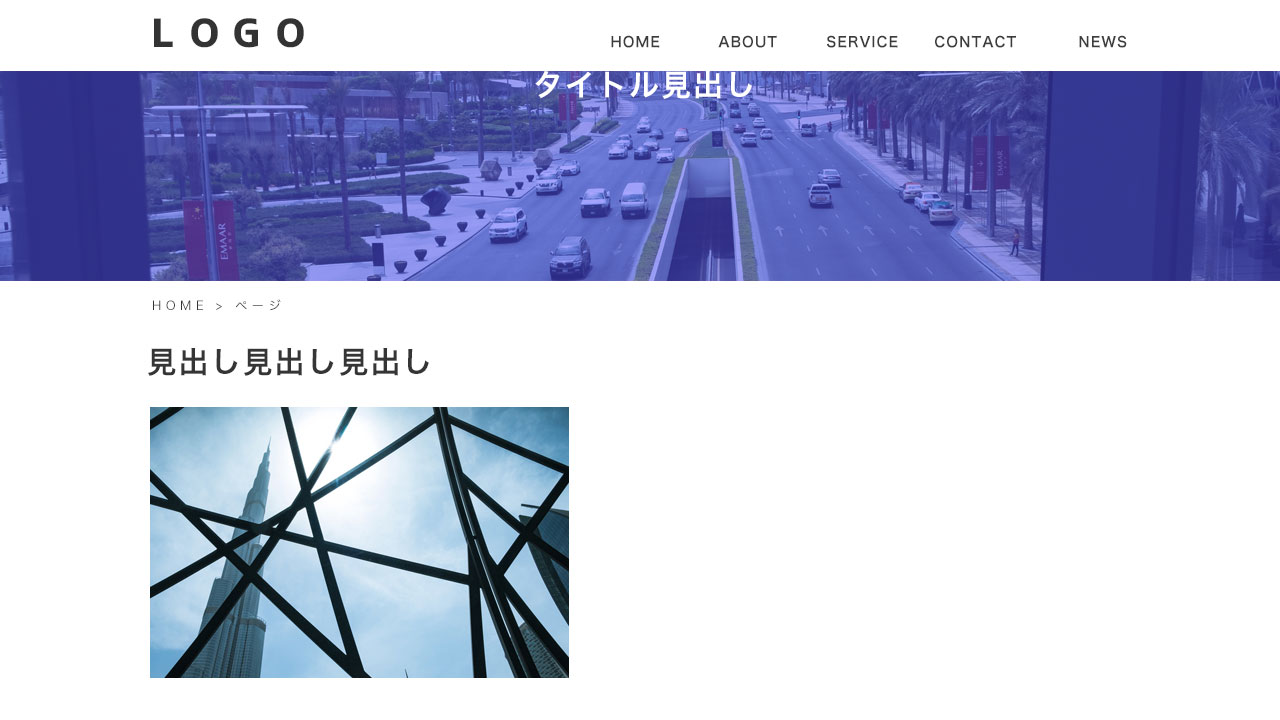
どうもIE11の場合は「min-height:」と組み合わせると、うまく真ん中にいってくれないバグが発生するようだ。通常のheightで対応すれば、表示バグはなくなる。
.page_ttl {
    height: 200px;
    display: flex;
    align-items: center;
    background: url(../img/bg_ttl.jpg);
    background-size: cover;
}
もしくは、IEのみ「height」を設定する。
.page_ttl {
    min-height: 200px;
    display: flex;
    align-items: center;
    background: url(../img/bg_ttl.jpg);
    background-size: cover;
}
@media all and (-ms-high-contrast: none){
    .page_ttl {
        height: 200px;
  }
}
もしくは、paddingで空間をあけるか。
.page_ttl {
    padding: 50px 0;
    line-height: 1.2;
}
ベースラインシフトや上下の行間の差があるフォントのタイプの場合は、「line-height」も調整してあげるとより真ん中に調整することができます。