(K)コピペでサクッと使えるCSSで作成した<H>タグ見出しのまとめ7個

HTMLのコンテンツの文書構成で特に重要なのは見出しですが、項目事の振り分けのために見出しのデザインは何かと気を使います。マークアップにも、見た目にも見やすさが重要です。昔はPhotoshopでつくった画像が一般的でしたが、スマホでの表示サイズの違いなども考えると、最低限テキスト部分だけはソースコードで書く必要があります。その方がメンテンスの柔軟性ができますからね。
そんな訳で今回は、CSSで組んだタイトルをまとめました。
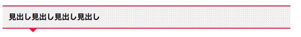
【1】文章のある部分だけ色が変わる下線タイプの見出し
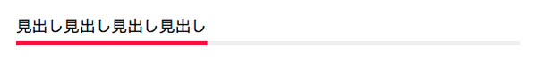
<h class="title01"><span>見出し見出し見出し見出し</span></h>
この見出しだけ、文字と見出しの領域を別々に取得するため、<h>の中に<span>をかましています。
h.title01{
     margin-bottom: 40px;
     font-size: 1.78em;
     background: url('img/title_bg_gray.png') repeat-x scroll left bottom transparent;
}

h.title01 span{
     display: inline-block;
     font-size: inherit;     /**祖先要素の指定を継承**/
     border-bottom: 5px solid #F70841;
     padding-bottom:5px;
}
グレーの線の部分は画像でリピートさせています。<h>にはグレーのラインを、<span>には赤のラインを引かせているってイメージですね。
【2】左側に折込がついたタイプの見出し
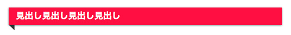
<h class="title02">見出し見出し見出し見出し</h>
ここからのHTMLはclass名が違うだけで全部一緒です。
h.title02{
    position: relative;
    color: #fff;
    background: #F70841;
    font-size: 18px;
    padding:8px 15px;
    font-weight: bold;
    box-shadow: 0 1px 3px #777;
    -moz-box-shadow: 0 1px 3px #777;
    -webkit-box-shadow: 0 1px 3px #777;
    -o-box-shadow: 0 1px 3px #777;
    -ms-box-shadow: 0 1px 3px #777;
}

h.title02:after{
    content: "";
    position: absolute;
    top: 100%;
    height: 0;
    width: 0;
    border: 6px solid transparent;
    border-top: 6px solid #333;
    left: 0;
    border-right: 6px solid #333;
}
擬似要素を使って、6pxのboaderを「top」と「right」に引いてるだけです。もし反対側に付けたい場合は「left: 0;」を「right:0;」にするだけです。
【3】文章前に四角形の装飾がついたタイプの見出し
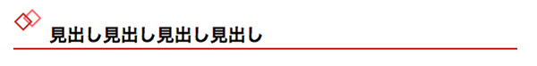
<h class="title03">見出し見出し見出し見出し</h>
h.title03{
    position: relative;
    font-size: 2.0em;
    font-weight: bold;
    margin: 0 0 1.5em;
    padding: 0.5em 0.5em 0.1em 2.0em;
    border-bottom: 2px solid #B92A2C;
    }

h.title03:before{
    content: "◇";
    font-size: 180%;
    position: absolute;
    color: #ff6b6e;
    top: -0.6em;
    left: 0.3em;
    height: 12px;
    width: 12px;
}

h.title03:after{
    content: "◇";
    font-size: 180%;
    position: absolute;
    color: #B92A2C;
    top: -0.5em;
    left: 0;
    height: 12px;
    width: 12px;
}
webデザイナーの方なら知らない人はいないんじゃないですか?Webクリエイターボックスさん風の見出しですね。「:before」と「:after」に四角形を一つずつ用意して「position」で位置を調整するという感じです。ブラウザによって微妙に大きさに差異があるので、この辺は少々調整の必要ありかな?ってトコです。
【4】最初の1文字だけサイズの違うタイプの見出し
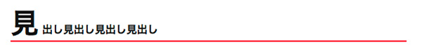
<h class="title04">見出し見出し見出し見出し</h>
h.title04{
    color: #111;
    font-size: 15px;
    font-weight: bold;
    margin: 0 0 1.5em;
    border-bottom: 2px solid #F70841;
}


h.title04:first-letter{
    font-size:40px;
    margin-right: 5px;
}
「:first-letter」で最初の文字だけ大きく指定しているシンプルな構造の見出しです。
【5】文章前に◯がついて上下線の入ったタイプの見出し
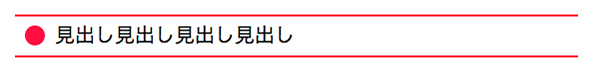
<h class="title05">見出し見出し見出し見出し</h>
h.title05{
    position: relative;
    margin: 0 0 1.5em;
    padding: 0.4em 0 0.4em 2.0em;
    font-size: 20px;
    border-bottom: 2px solid #F70841;
    border-top: 2px solid #F70841;
}

h.title05:before{
    content: "";
    position: absolute;
    background: #F70841;
    top: 50%;
    left: 0.5em;
    margin-top :-10px;
    height: 20px;
    width: 20px;
    border-radius: 10px;
}
「:before」の◯の部分は「width」と「height」の正方形を指定して、「border-radius」で丸くしてます。
【6】下に吹き出しがついたタイプの見出し
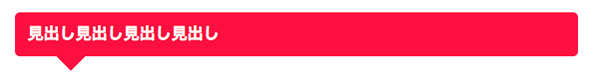
<h class="title06">見出し見出し見出し見出し</h>
h.title06{
    position: relative;
    margin: 0 0 1.5em;
    padding: 0.8em;
    background: #F70841;
    color: #fff;
    font-size: 1.6em;
    font-weight: bold;
    border-radius: 5px;
    -webkit-border-radius: 5px;
    -moz-border-radius: 5px;
}

h.title06:after{
    position: absolute;
    bottom: -15px;
    left: 10%;
    z-index: 90;
    margin-left: -15px;
    border-top: 15px solid #F70841;
    border-left: 15px solid transparent;
    border-right: 15px solid transparent;
    border-bottom: 0;
    content: "";
}
吹き出し風の尖った部分を出して、吹出し風の見出しです。
【7】吹き出し部分を改良して背景に斜め線を入れたタイプの見出し
<h class="title07">見出し見出し見出し見出し</h>
h.title07{
    position: relative;
    margin: 0 0 1.5em;
    padding: 0.8em;
    border-top:2px solid #F70841;
    border-bottom:2px solid #F70841;
    color: #000;
    font-size: 1.6em;
    font-weight: bold;
    background: -webkit-gradient(linear, left top, right bottom, from(#ddd), color-stop(0.25, #ddd), color-stop(0.25, white), color-stop(0.5, white), color-stop(0.5, #ddd), color-stop(0.75, #ddd), color-stop(0.75, white), to(white));
     background: -moz-linear-gradient(-45deg, #ddd 25%, white 25%, white 50%, #ddd 50%, #ddd 75%, white 75%, white);
     background: linear-gradient(-45deg, #ddd 25%, white 25%, white 50%, #ddd 50%, #ddd 75%, white 75%, white);
     background-size: 4px 4px;

}

h.title07:after{
    position: absolute;
    bottom: -10px;
    left: 10%;
    z-index: 90;
    margin-left: -10px;
    border-top: 10px solid #F70841;
    border-left: 10px solid transparent;
    border-right: 10px solid transparent;
    border-bottom: 0;
    content: "";
}
モブログの女王のあかめさんのあかめ女子のwebメモ風の見出しタイトルです。
backgroundの斜線ボーダーの引き方は以下のサイトを参考にしましたm(_ _)m
【8】グラデーションのかかったリッチデザインタイプの見出し
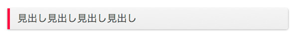
<h class="title08">見出し見出し見出し見出し</h>
h.title08{
    font-size: 2.0em;
    padding: 10px 15px;;
    color: #50534F;
    border-left: 5px solid #F70841;
    border-radius: 0px 4px 4px 0px;
    text-shadow: 0px 1px 0px #FFF;
    box-shadow: 0px 1px 3px rgba(0, 0, 0, 0.3), 1px 1px 0px rgba(255, 255, 255, 0.7) inset, 0px 1px 0px #FFF, 1px 0px 0px #F0F0F0, -1px 0px 0px #F0F0F0;
    background-image: linear-gradient(#F4F4F4 0%, #EEE 100%);
}
グラデーションとボックスシャドウとテキストシャドウとCSS3の機能を使った目を引く見出しデザインです。
まとめ
以下のサイトを参考に自分なりにカスタマイズさせていただきましたm(_ _)m
見出しのデザインをCSSのみでカスタマイズする(一部CSS3対応)
一応、今回作成した見出しをまとめておきました。
見出しってけっこう重要なポイントで、ほとんどのWEBサイトで使われる項目なので、自分のデザインのバリエーションとして、もっと持っておきたいトコロです。またストックが溜まったらまとめたいと思います。今回は以上ですm(_ _)m